Appearance
Layout
Positioning
The notifications' stream is a fixed-positioned element appended to the body using Vue Teleport.
When choosing *-right or *-left positions, notifications are placed at the edge of the window (minus the offsets).
In some layouts, you may prefer to visually keep the stream "inside" the app container or below a fixed header.
In such case, the following variables can be used to control the inset of the stream:
| Variable Name | Description | Default |
|---|---|---|
--nv-root-width | Maximum width of the root wrapper. | 100% |
--nv-root-top | Top offset of the root wrapper. | 1.25rem |
--nv-root-left | Left offset of the root wrapper. | 1.25rem |
--nv-root-right | Right offset of the root wrapper. | 1.25rem |
--nv-root-bottom | Bottom offset of the root wrapper. | 1.25rem |
Example
You've chose to position the stream at
top-rightbut you'd rather place it below the fixed header and keep it "inside" the app container.
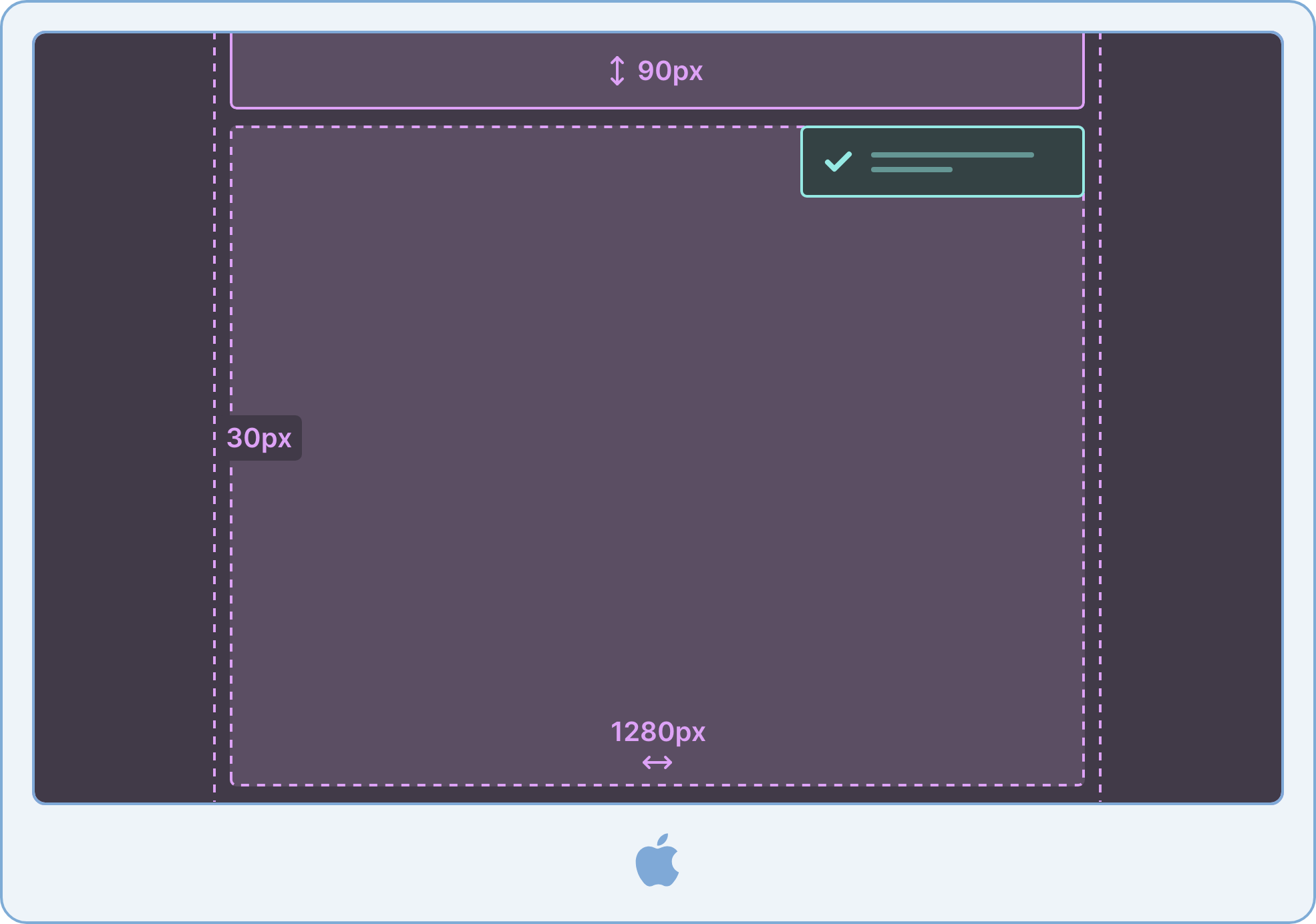
Assuming that:
- The header is 90px high
- The app container has a maximum width of 1280px including a padding of 30px on each side
vue
<template>
  <Notivue v-slot="item">
    <Notification :item="item" />
  </Notivue>
</template>

<style>
:root {
  /* Your variables */
  --header-height: 90px;
  --container-padding: 30px;
  --container-width: 1280px;

  /* Set the maximum width of the stream */
  --nv-root-width: var(--container-width);

  /* Add the top padding and place it below the header */
  --nv-root-top: calc(var(--header-height) + var(--container-padding));

  /* Add the same left-right paddings of your app container */
  --nv-root-left: var(--container-padding);
  --nv-root-right: var(--container-padding);
}

/* Rules for mobile devices */
@media (max-width: 768px) {
  :root {
    --header-height: 60px;
    --container-padding: 20px;
  }
}
</style>
Centering on mobile devices
If you chose *-right or *-left positions, you might want to always center the notifications within a specific width:
vue
<template>
  <Notivue v-slot="item">
    <Notification :item="item" />
  </Notivue>
</template>

<style>
@media (max-width: 768px) {
  :root {
    --nv-root-x-align: center;
  }
}
</style>
Gap and z-index
| Variable Name | Description | Default |
|---|---|---|
--nv-z | z-index of the notifications stream | 500 |
--nv-gap | Gap between notifications | 0.75rem |
vue
<template>
  <Notivue v-slot="item">
    <Notification :item="item" />
  </Notivue>
</template>

<style>
:root {
  --nv-gap: 1rem;
  --nv-z: 9999;
}

/* Rules for mobile devices */
@media (max-width: 768px) {
  :root {
    --nv-gap: 0.5rem;
  }
}
</style>